
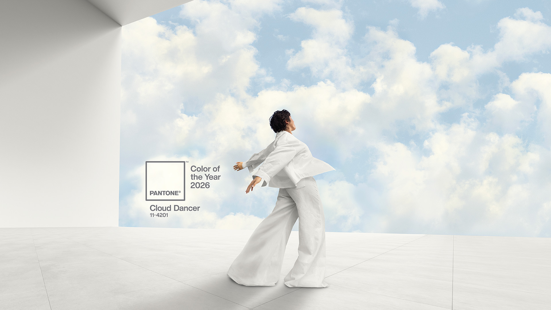
A lofty white whose aerated presence acts as a whisper of calm and peace in a noisy world / Credit: Pantone
Every year, the Pantone Color Institute releases its Colour of the Year. With it comes valuable colour insights into how people are feeling and how that mood shows up across industries. Sometimes the choice reflects confidence or optimism. For 2026, the message is quieter—and more thoughtful.
The selected shade, Pantone 11-4201 Cloud Dancer, is a soft, off‑white inspired by the gentle light of a nimbus cloud drifting across an open sky. It’s calm, subtle, and intentionally restrained. For the travel industry, this colour story feels especially relevant. As travelers seek space, simplicity, and comfort, Cloud Dancer reflects this change. This shift is already happening in booking conversations and customer expectations.
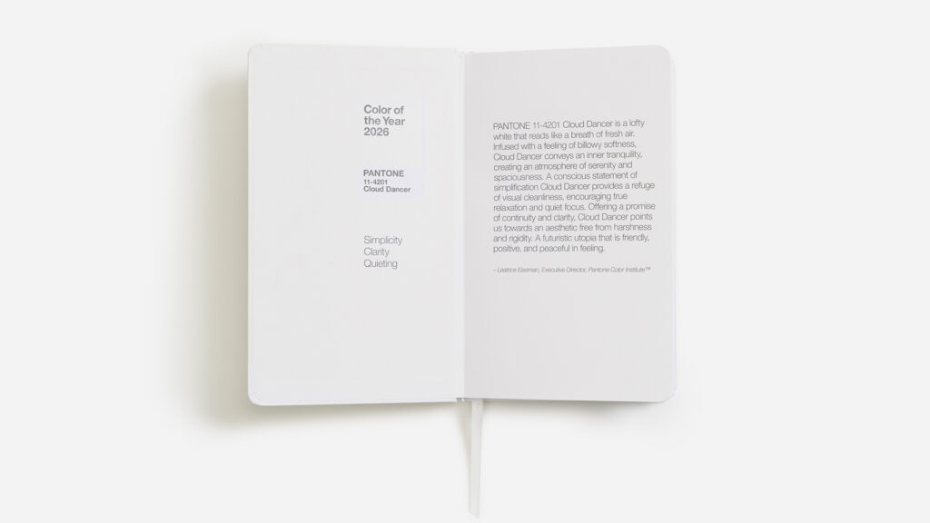
PANTONE 11-4201 Cloud Dancer Notebook / Credit: Pantone
Why Pantone chose Cloud Dancer for 2026
This marks the first time the Pantone Color Institute has selected a white shade as its Colour of the Year, making the choice especially notable. According to Leatrice Eiseman, Executive Director of the Pantone Color Institute, the decision reflects today’s fast, over‑stimulated society and the growing need for visual calm. “At this time of transformation, when we are reimagining our future and our place in the world, PANTONE 11‑4201 Cloud Dancer is a discrete white hue offering a promise of clarity,” she explains. Designed as a visual pause, Cloud Dancer allows both the eye and the mind to rest. Eiseman adds that as “the cacophony that surrounds us has become overwhelming,” this conscious statement of simplification “enhances our focus, providing release from the distraction of external influences.”
Laurie Pressman, Vice President of the Pantone Color Institute, describes Cloud Dancer as a response to our increasingly digital future that remains grounded in human connection. For 2026, the colour story focuses on intention and reflection rather than demanding attention. As Pressman explains, “An airy white hue, PANTONE 11-4201 Cloud Dancer opens up space for creativity, allowing our imagination to wander and drift so that new insights and bold ideas can emerge and take shape,” reinforcing its role as a quiet yet purposeful foundation for connection and creative thought.
For travel professionals, this aligns closely with what clients describe when they ask for “easy” or “peaceful” trips.

Credit: Rodion Kutsaiev
What this colour story reveals about traveler behaviour
Pantone’s colour insights come from studying design trends, fashion, lifestyle, and culture around the world. Industry experts see Cloud Dancer as a sign that people are simplifying—not just their spaces, but their schedules too.
In travel, this shows up as:
– Strong interest in slow travel, wellness travel, and quiet luxury
– Less tolerance for packed itineraries and constant movement
– A desire for trips that feel restored, not exhausted
– Greater focus on emotional value and personal customer experience
Canadian travel advisors may notice travelers choosing fewer destinations, longer stays, and hotels that emphasize space, light, and calm design rather than excess.

Endless horizons and shimmering salt crystals at Uyuni Salt Flat, Bolivia. Credit: Amy Rollo
Global colour stories told through destinations
Pantone often talks about global colour stories, and Cloud Dancer already exists naturally in many destinations around the world. These places capture the same sense of openness, clarity, and softness without being designed around a trend.
Architectural settings
– Arequipa, Peru, often called “The White City,” built from pale volcanic stone
– Alberobello, Italy, where whitewashed trulli houses feel timeless and quiet
– The Taj Mahal, whose white marble changes gently with daylight
Natural landscapes
– Salar de Uyuni, Bolivia, where white salt flats stretch endlessly and reflect the sky
– White Sands National Park, a smooth, calming landscape of gypsum dunes
– Pamukkale, Türkiye, with soft white mineral terraces shaped by water
The Atacama Desert in Chile also fits the Cloud Dancer aesthetic in a different way. While known for its dryness and dramatic terrain, its vast salt flats, pale basins, and high‑altitude light create a similar sense of visual clarity and stillness. This is especially true at sunrise.
And then there’s Lençóis Maranhenses National Park in Brazil, where rolling white sand dunes are paired with seasonal blue‑green lagoons. It feels like a living Cloud Dancer canvas, constantly reshaped by light and rain.

Credit: Pantone
Cloud Dancer and mindful travel
Cloud Dancer also supports the ongoing shift toward sustainable and mindful travel. Its simplicity reinforces ideas around protection, preservation, and respect for place.
This makes it easier to highlight:
– Smaller groups
– Locally owned partners
– Shoulder‑season travel
– Lower‑impact experiences
Instead of selling “more,” the travel industry can focus on depth and connection.

PANTONE 11-4201 Cloud Dancer FHI Guide Usage / Credit: Pantone
What Cloud Dancer means for design, branding, and social media
Cloud Dancer also plays a practical role in 2026 design trends. Pantone has paired it with a group of very soft, powdered pastels, using Cloud Dancer as the foundation colour. It acts as visual breathing room.
For travel brands, this works especially well across:
– Websites and digital brochures
– Travel documents and proposals
– Social media feeds that prioritize calm, cohesive visuals
A lighter aesthetic reduces visual fatigue and helps messaging feel more trustworthy. In a crowded online space, this kind of design supports a stronger customer experience by making content feel easy to absorb.
Industry experts regularly point out that colour choices influence first impressions. Cloud Dancer signals clarity, honesty, and care—qualities that matter when someone is deciding where to spend their time and money.

PANTONE 11-4201 Cloud Dancer Keychain / Credit: Pantone
How Canadian travel professionals can apply this trend
You don’t need to reference Pantone in client meetings to benefit from this shift. Cloud Dancer works best when translated into how trips are planned and presented.
In conversation, that might sound like:
– “More time in one place so the trip feels grounded”
– “A lighter, more balanced itinerary”
– “Moments built in just to enjoy where you are”
For tour operators and DMCs, this supports designing trips with:
– Fewer transfers
– Thoughtful pacing
– Meaningful local connections
For destination marketers, Cloud Dancer aligns beautifully with Canadian landscapes—coastal regions, northern destinations, lakes, and wide open spaces that naturally reflect calm and clarity.

White Afternoon Tea at Lian Lounge, Mandarin Oriental Shenzhen / Credit: Mandarin Oriental
Mandarin Oriental and Pantone: Cloud Dancer in practice
As the official hospitality partner of Pantone’s Colour of the Year 2026, Mandarin Oriental is one of the first global brands translating Cloud Dancer into a guest experience. Across select properties worldwide, the group is interpreting the colour story through a series of thoughtful, sensory‑led moments.
Guests will encounter Cloud Dancer through curated afternoon tea experiences, spa treatments designed to feel restorative and weightless, and stays that emphasize height, light, and openness. Some locations are even introducing Cloud Dancer post boxes for seasonal messages, adding a gentle, human touch that aligns with the colour’s quieter mood.
Festive décor in participating hotels brings the shade to life in ways that feel soft, refined, and intentional. Rather than relying on bold statements, these environments invite guests to slow down and notice small details—how light moves through a space, how materials feel, and how calm can become part of the luxury experience.
Participating properties include Mandarin Oriental Hyde Park, London; Mandarin Oriental, New York; Mandarin Oriental, Boston; Mandarin Oriental, Geneva; Mandarin Oriental, Hong Kong; Mandarin Oriental, Shenzhen; Mandarin Oriental Pudong, Shanghai; Mandarin Oriental, Tokyo; Mandarin Oriental, Marrakech; and the newly opened Mandarin Oriental Downtown, Dubai.
For travel professionals, this collaboration is a clear signal of how leading hospitality brands are responding to changing guest expectations—using colour, design, and pacing to create experiences that feel considered, comforting, and quietly memorable.

PANTONE 11-4201 Cloud Dancer Limited Edition Latte / Credit: Pantone
Looking ahead to 2026
According to the Pantone Color Institute, Cloud Dancer sets a quiet but powerful tone for 2026. Its colour story reflects a desire for balance, space, and meaningful connection—values that already guide many travel decisions.
For Canadian travel advisors, tour operators, DMCs, and destination marketers, this trend offers a clear lesson. Thoughtful design, calm messaging, and well-paced travel experiences are becoming essential. They are not optional.
Sometimes the strongest impression isn’t made by adding more, but by creating room for people to slow down, look around, and enjoy where they are. Wishing you a peaceful and inspiring 2026!