
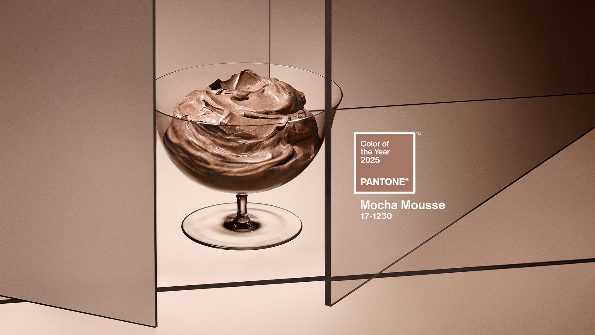
Pantone’s Color of the Year for 2025 – Mocha Mousse, a soft, comforting shade of brown —
it reflects our need for warmth and comfort, and our desire for grounding in a fast-paced world / Credit: Pantone
Have you ever found yourself wrapped in a cozy blanket while sipping a rich cup of hot cocoa? This familiar scene reflects the introduction of Pantone’s Colour of the Year for 2025, Mocha Mousse, a delicious brown hue that promises to bring comfort and warmth into our lives.
Introduction to Pantone and Its Colour of the Year Selection
Pantone, established in the 1960s, has become the global authority on colour, influencing trends across industries from fashion to interior design. Each year, Pantone selects a colour, which serves as a barometer of cultural moods and attitudes, guiding designers and consumers alike.
The announcement of the Colour of the Year is often a highly anticipated event, typically revealed through a creative public event that captures the imagination. This year, the unveiling took place at the iconic London Eye, showcasing the vibrant energy and excitement surrounding Pantone’s choice.
What is PANTONE 17-1230 Mocha Mousse?
It is a rich, soft brown that evokes feelings of warmth and comfort. Its visual characteristics are reminiscent of delectable treats like chocolate and coffee, appealing to our senses and inviting indulgence.
“PANTONE 17-1230 Mocha Mousse expresses a level of thoughtful indulgence. Sophisticated and lush, yet at the same time an unpretentious classic,” says Leatrice Eiseman, Executive Director Pantone Color Institute.
The Emotion Behind Mocha Mousse: Colour Psychology and Human Connection
Brown is frequently associated with comfort and reliability. It can evoke a sense of security, reminiscent of cozy spaces and familiar environments. The impact of colour on our mood is profound; for many, shades of brown can inspire feelings of contentment and warmth.
“Harmony brings feelings of contentment, inspiring a positive state of inner peace, calm, and balance as well as being tuned in with the world around us,” added Laurie Pressman, Vice President of the Pantone Color Institute.
Pantone Colour of the Year 2025 in Travel
Several countries are known for incorporating rich brown hues in their architecture, reflecting their cultural heritage, natural surroundings, and building traditions. It’s fascinating to see how these hues tell a story of a place:
Ethiopia
Ethiopia stands out for its use of rich brown hues in architecture, particularly due to its strong connection to coffee culture. As the birthplace of coffee, the country’s landscape and traditional buildings often feature warm, earthy tones that resonate with the Mocha Mousse color trend. The country’s diverse terrain, from highlands to lowlands, naturally showcases a palette of brown shades in its built environment.
Mexico
Mexican architecture often incorporates vibrant colors, including rich browns. In some areas, the use of brown tones is tied to the natural building materials like adobe and wood. The warm climate and cultural preferences have led to a tradition of colourful facades, with brown serving as both a primary colour and a complementary hue.
Italy
Italian architecture, especially in rural and historical areas, is known for its use of earthy tones, including various shades of brown. This is particularly evident in Tuscan architecture, where the use of natural materials like terracotta and stone contributes to a warm, brown-dominated palette. The pigments raw sienna and burnt sienna, named after the Italian city of Siena, have been used in architecture and art for centuries.
Japan
Japanese traditional architecture often features rich brown hues, particularly in wooden structures. The use of natural materials and earth tones is a fundamental aspect of Japanese design philosophy. The colour Raku, a rich mahogany shade inspired by ancient Japanese tea ceremonies, exemplifies this connection between brown hues and Japanese cultural aesthetics.
Every year, Pantone unveils a Colour of the Year that resonates globally, influencing trends in fashion, interior design, and beyond. It often mirrors the spirit of the times, capturing our feelings and shared experiences. Each country, with its unique scenery and culture, interprets the chosen hue in its own special way.